Friday 4 March 2011
Lewis and Danielle: In what ways does your media product use, develop or challenge forms and conventions of real media texts? (Directors Commentary)
This is our video response to Question 1, we visually compare our video with other professional music videos.
Thursday 3 March 2011
Evaluation - Alistair
Question 1
Media Evaluation - Alistair Dickson
Question 2
Question 3
Media Evaluation - Alistair Dickson
Question 4
Media Evaluation - Alistair Dickson
Question 2
Evaluation on Prezi
Question 3
Media Evaluation - Alistair Dickson
Question 4
Evaluation on Prezi
Thursday 10 February 2011
Evie Evaluation
Question 1 -
Question 2
Question 3
div class="prezi-player">
Question 4 - Technologies we used.
One of our main tools for this practical project was the internet. We used the internet throughout the process to:-


We also dragged the track onto the timeline in order for us to edit the video in time to time it so that the track and was in sync.
Once we had produced a rough edit of our video to the track, we then set about adding effects to make our video more interesting. We used:-
Colour corrector - To colour grade all our our footage, which meant that all of the colours were more vibrant than when they were originally uploaded. This included adding a green tint to all the scenes with the doors, and a purple tint to the shots of the demolition site. I did this by moving the arrow on the right hand wheel around, to change the tint of each shot and then moving the dot on the left hand wheel until I had the right intensity.

For the main part the colour grading was just intensifying the original colours in each of the shots, however in the shots of the house I added a green tint to give the hall an eerie feel and I also changed the tint of all the scenes of the demotition site, giving them a more apocalyptic feel. We also used the bars at the bottom to remove the colour from the shots, leaving black and white (greyscale) shots at the beginning which actually represented the real world and then the contrast of all the bright colours used in the rest of the video show how much more vibrant his dreams are than reality is.


The effects tab - to select the transitions option which allowed us to apply transitions between the cuts to show the passing of time and to add interest. We used cross fades, non additive dissolves and additive dissolves and a fade out at the end.

Chroma-keyer - To remove the background on all our our sections of greenscreen. I also used an *8 point garbage matte to remove small snippets of green which were still appearing

 on the background due to shadows a slight movement in the cloth. There were also problems when editing the green screen for the shots we used in the hanging scene. The way in which we filmed this was using a tabe which we had to place on the green screen. Lewis then sat on the table and swung his legs back and forth to create a swinging motion as if his legs were dangling in the air. We then had place the camera on a tripod which was very low down in order to get a steady shot where only his legs could be seen without any of the table in the shot. When we came to the process of editing out the green we found that the table had cast a shadow on the green screen and so the cloth wasn't evenly lit, and some patches of the green were difficult to get rid of. We also found that because the shade of green used was a very bright, almost fluorescent, it meant that the colour reflected on the white shoes, making it difficult to get a clear outline. In order to get past this problem I had to edit the colour of the shoes and the brightness and contrast so that some of the green disappeared.
I used a number of different video tracks - in order to layer footage on top of each other. I had to then change the opacity of the shots so both layers could be seen.
The shots which we layered over the top of our initial video were all lip synching shots. These were diffucult to do as they took a lot of fine tuning. First we had to find the exact point in the film of the lips miming which we wanted to use. We then had to cut this section out and move it to the right position in the track. This took quite a while to get it completely accurate as the movement of the mouth had to be exactly in time with the singing on the track. When we had finally dragged it into place, we then had to change the opacity of the layer so that it would enable the footage on the track underneath to be seen. This was quite tricky because depending on the colour of the footage underneath the top layer was not always at the same opacity in each section of layering which meant that rather than just being able to bring the opacity of the whole track.
Ancillaries
I used photoshop, and Indesign for my ancillary products.
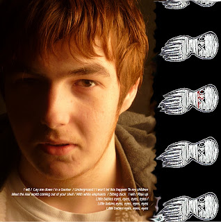
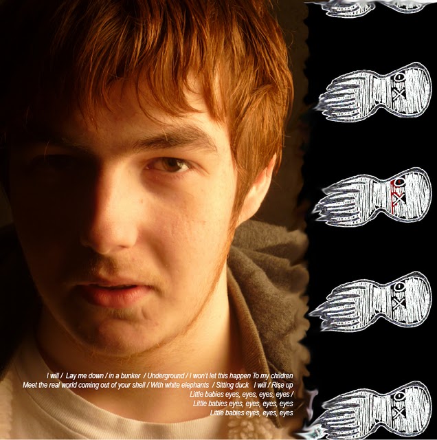
 The black and white CD insert that I created was more difficult in terms of editing. I used a screen shot of one of the scenes in the video as the background. Which I imported into photoshop. Then on a separate photoshop file, I edited the photo for the foreground of the insert. Firstly I had to cut out Lewis as the main subject. I did this by selecting the freeform pen tool from the toolbar on the left of the screen, and then clicking all the way around the edge of the photo to create an outline around him. I then clicked on create path and so that a dotted line appeared around the image. I then inverted the selection so the dotted line appeared around the background and then pressed delete to get rid of the background. Danielle then did the next section of editing by adding an effect to the picture so that the image was stylised. This edited image was then placed on top of the screenshot we imported into the other photoshop project.
After the images had been edited on photoshop, we then placed them in Indesign in order to change the layout and add text. We used the text tool to type the title and information and then dragged it around until it was in the correct place . I placed the text around the image at the bottom of the magazine advert to make it more visually interesting to look at. We downloaded our font from the internet.
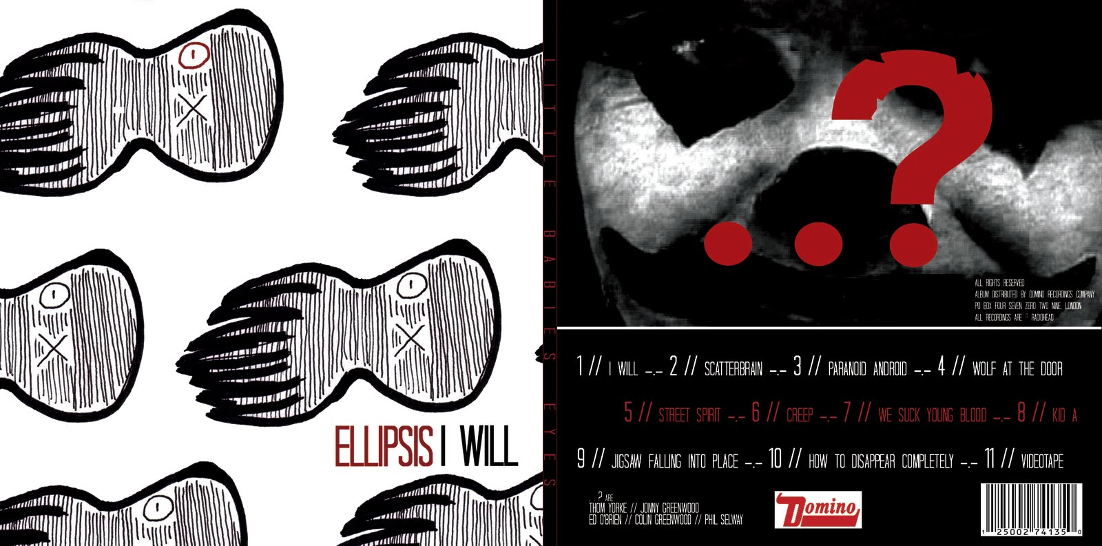
With the coloured CD insert I used the smudge tool on Indesign to merge the image down the side with the octopus on and the original photo. I did this so that there was not such a harsh contrast between the two elements. I used a text box to write the lyrics and then moved the box around until there was a point where all the lyrics could be seen against the background. I had to alter the font using the text toolbar in this insert as the tiny writing that was used was not easily legible in the previous font.
For me, having never used any of these programmes before I did find a lot of this work quite challenging, particularly the work in photoshop and Indesign. I found that with final cut I did manage to learn the different techniques relatively quickly, however in photoshop and Indesign I struggled with remembering how I edited my work and this meant that I had to keep trying to relearn my previous skills.
Overall thoughts on the project.
I think that throughout our projects we could have worked better as a group. We were quite lapse on organisation skills, particularly when it came to things such as sorting out booking the studio for green screening and setting particular dates which to film.
I think that overall we produced a good music video as we spent a lot of time editing and putting it all together, however I am not sure that our brand image is strong enough amongst all our media products. I know I personally put a lot of effort and time into this project and I think overall I managed my time pretty well and was able to produce some good products in the alotted time we had to complete this.
If I had done this project again I would definitely put more focus on logging our practical work. I don't feel that we had enough pictures of editing and actually producing our final media products, but I think that overall we did do a good job and managed to produce all of the products to a reasonable standard.
By Evie
Question 2
Question 3
Question 4 - Technologies we used.
One of our main tools for this practical project was the internet. We used the internet throughout the process to:-
- Research music videos and all things related to music video
- Download videos and audio tracks
- Create our interactive blog
When creating our music video we used a few different elements of technology.
We used a video camera to film all of our footage before the editing process.
We then used final cut express to edit our footage.
We imported the footage into the programme by clicking 'file' > 'capture' on the top menu options.
Once we had uploaded the footage, we then dragged it onto the timeline in order for us to edit it.
We also dragged the track onto the timeline in order for us to edit the video in time to time it so that the track and was in sync.
Once we had produced a rough edit of our video to the track, we then set about adding effects to make our video more interesting. We used:-
Colour corrector - To colour grade all our our footage, which meant that all of the colours were more vibrant than when they were originally uploaded. This included adding a green tint to all the scenes with the doors, and a purple tint to the shots of the demolition site. I did this by moving the arrow on the right hand wheel around, to change the tint of each shot and then moving the dot on the left hand wheel until I had the right intensity.
For the main part the colour grading was just intensifying the original colours in each of the shots, however in the shots of the house I added a green tint to give the hall an eerie feel and I also changed the tint of all the scenes of the demotition site, giving them a more apocalyptic feel. We also used the bars at the bottom to remove the colour from the shots, leaving black and white (greyscale) shots at the beginning which actually represented the real world and then the contrast of all the bright colours used in the rest of the video show how much more vibrant his dreams are than reality is.


The effects tab - to select the transitions option which allowed us to apply transitions between the cuts to show the passing of time and to add interest. We used cross fades, non additive dissolves and additive dissolves and a fade out at the end.
Chroma-keyer - To remove the background on all our our sections of greenscreen. I also used an *8 point garbage matte to remove small snippets of green which were still appearing

I used a number of different video tracks - in order to layer footage on top of each other. I had to then change the opacity of the shots so both layers could be seen.

Ancillaries
I used photoshop, and Indesign for my ancillary products.


 The black and white CD insert that I created was more difficult in terms of editing. I used a screen shot of one of the scenes in the video as the background. Which I imported into photoshop. Then on a separate photoshop file, I edited the photo for the foreground of the insert. Firstly I had to cut out Lewis as the main subject. I did this by selecting the freeform pen tool from the toolbar on the left of the screen, and then clicking all the way around the edge of the photo to create an outline around him. I then clicked on create path and so that a dotted line appeared around the image. I then inverted the selection so the dotted line appeared around the background and then pressed delete to get rid of the background. Danielle then did the next section of editing by adding an effect to the picture so that the image was stylised. This edited image was then placed on top of the screenshot we imported into the other photoshop project.
After the images had been edited on photoshop, we then placed them in Indesign in order to change the layout and add text. We used the text tool to type the title and information and then dragged it around until it was in the correct place . I placed the text around the image at the bottom of the magazine advert to make it more visually interesting to look at. We downloaded our font from the internet.
With the coloured CD insert I used the smudge tool on Indesign to merge the image down the side with the octopus on and the original photo. I did this so that there was not such a harsh contrast between the two elements. I used a text box to write the lyrics and then moved the box around until there was a point where all the lyrics could be seen against the background. I had to alter the font using the text toolbar in this insert as the tiny writing that was used was not easily legible in the previous font.
For me, having never used any of these programmes before I did find a lot of this work quite challenging, particularly the work in photoshop and Indesign. I found that with final cut I did manage to learn the different techniques relatively quickly, however in photoshop and Indesign I struggled with remembering how I edited my work and this meant that I had to keep trying to relearn my previous skills.
Overall thoughts on the project.
I think that throughout our projects we could have worked better as a group. We were quite lapse on organisation skills, particularly when it came to things such as sorting out booking the studio for green screening and setting particular dates which to film.
I think that overall we produced a good music video as we spent a lot of time editing and putting it all together, however I am not sure that our brand image is strong enough amongst all our media products. I know I personally put a lot of effort and time into this project and I think overall I managed my time pretty well and was able to produce some good products in the alotted time we had to complete this.
If I had done this project again I would definitely put more focus on logging our practical work. I don't feel that we had enough pictures of editing and actually producing our final media products, but I think that overall we did do a good job and managed to produce all of the products to a reasonable standard.
By Evie
Feedback on Draft - Miss McNulty
A promising start Evie but just more detail needing to be added to your questions...
- Question one - isnt finished as you told me - you may have ot upload the video straight onto the blog if copyright is blocking it.
- Question 2- Good on branding- get a few quotes from your pack in here to on definitions of branding
be more detailed in how your brand image is portrayed through your video - the narrative ,events, characters, shots, colours , mise en scene- this needs to be double the length to get the top grades - get a few more stills from the video too to illustrate your points.
- Question 3- excellent prezi! Well used with images and videos - just to 'bump' your marks up a little I would like a little more on how the intial audince reserch guided your final video e.g. appeal to males/females/younger audience - think about narrative, shots, mise ene scene, characters etc...
Also a couple of pie charts/bar charts on your findings from your final research will get you more marks and some more direct quotes from your feedback would be good - only a few included at the moment!
- Question 4 - Technologies- Lots more detail needed here - focus on Final Cut and Photoshop/Indesign mainly here - what did you actually do on this packages - were they easy to use? presented any problems? added to you creativity?
Dont forget and about a conclusion too - how you feel about your final projects- how you feel
you worked- time management etc... be positive you have produced some good products here!
Miss McNulty
Wednesday 26 January 2011

Friday 21 January 2011
Ancillaries - final Evie and Danielle


By Evie and Danielle
Subscribe to:
Posts (Atom)